Best Fujifilm Recipes for Summer
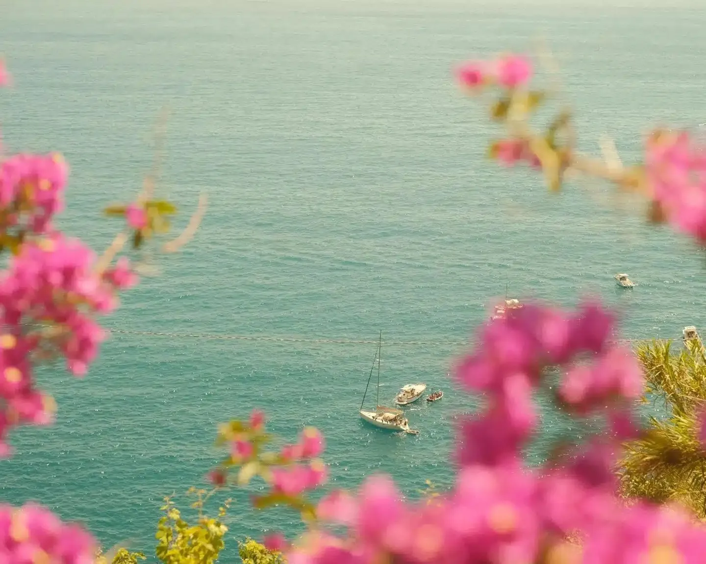
Summer is one of my favorite seasons to shoot. Strong light, warm tones, long evenings, beach days, and that golden hour that seems to last forever. The right Fujifilm recipe can turn an ordinary summer afternoon into images that feel like memories from an old vacation roll.
I've been using Fujifilm recipes for more than 10 years, and over time I've collected a small set that I keep coming back to every June, July, and August. Some are mine, some come from photographers I follow and respect. Five recipes made the list this year. Three are for stills, one is for video, and one is specifically for those magical evenings when the sun has already gone down.
If you're new to Fujifilm film recipes, the idea is simple. A recipe is a combination of in-camera JPEG settings (film simulation, white balance, grain, contrast, color, sharpness, and so on) saved as a custom preset. Once it's loaded, your photos come out finished, straight out of camera. No Lightroom, no editing, no hours in front of a screen. The only extra step I still take sometimes, once the JPEG is out of the camera, is a plain white border before I post it. I built a tool for that if you want to try it on your own shots.
Here are my five favorites Fujifilm recipes for summer 2026.
Italian Summer: Mediterranean warmth
Italian Summer is my own recipe, and it's the one I reach for the most when I travel along the Mediterranean. It was born from walks through Italian coastal villages, lazy afternoons by the sea, and that specific Southern European golden hour. I wanted colors that felt warm without being oversaturated, like looking at vacation photos from the 1980s.
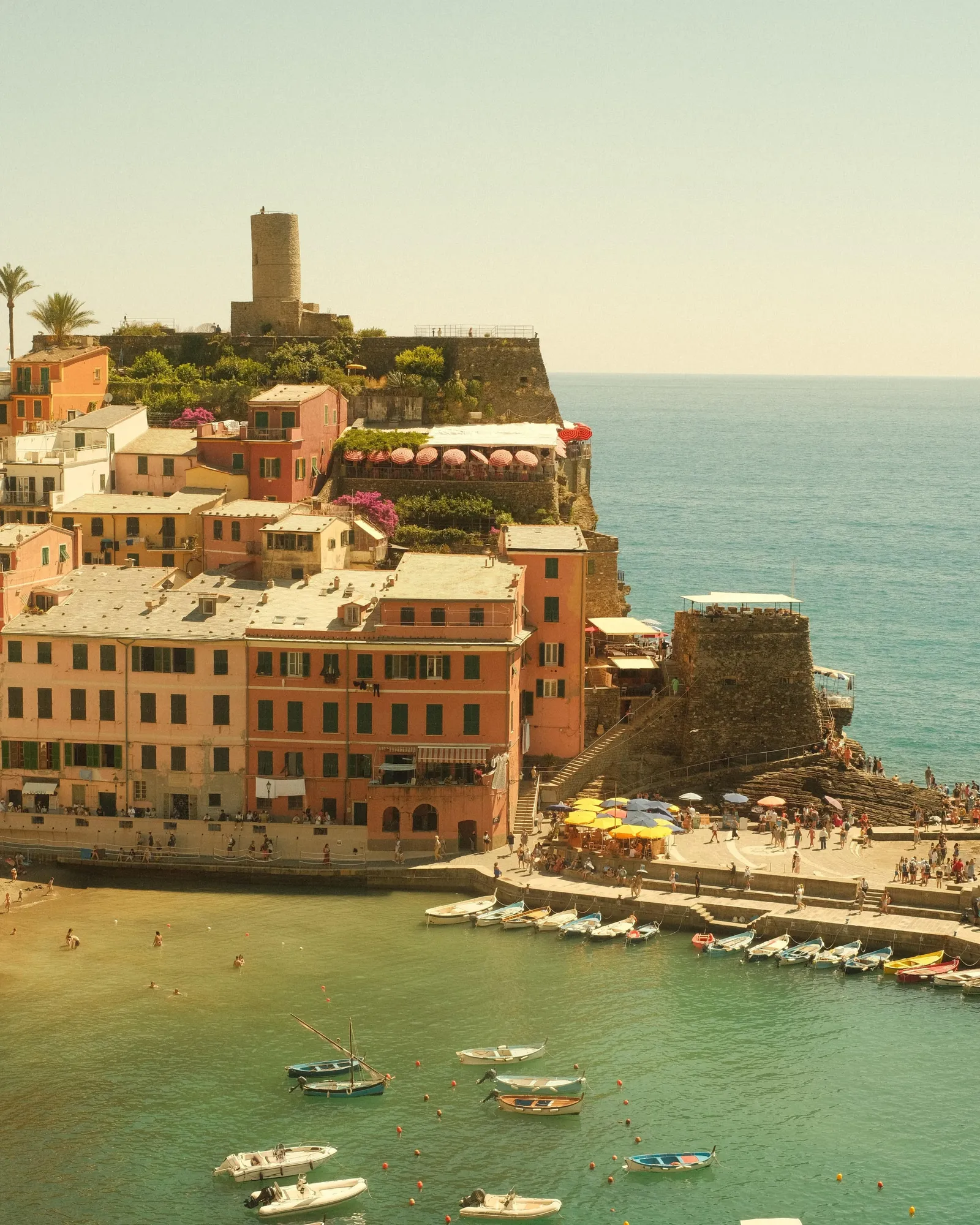
The recipe is built on Classic Chrome, a film simulation introduced in 2014 and inspired by classic documentary photography stocks. Classic Chrome has muted highlights and rich shadows, which pairs well with a warm white balance to create a nostalgic, film-like look without becoming too contrasty. The white balance is set to 7500K with a +4 Red and -6 Blue shift, which pushes the image toward those warm golden tones. Color is at +3 for slightly richer saturation, while Sharpness at -4 and Clarity at -2 keep things soft and organic.
The grain is set to Weak / Large, which adds a film-like texture without overwhelming the image. Dynamic Range DR200 helps preserve highlights in bright Mediterranean light, where the sun can be brutal at midday.
Italian Summer settings
| Film Simulation | Classic Chrome |
|---|---|
| Grain Effect | Weak / Large |
| Color Chrome Effect | Weak |
| Color Chrome FX Blue | Weak |
| White Balance | 7500K, +4 Red, -6 Blue |
| Dynamic Range | DR200 |
| Highlight | -1.5 |
| Shadow | -1.5 |
| Color | +3 |
| Sharpness | -4 |
| Noise Reduction | -4 |
| Clarity | -2 |
| Exp. Compensation | 0 to +1 |
| ISO | Start at 400 up to ISO 1600 |
When to use it
Italian Summer film recipe is at its best in warm, sunny conditions. Coastal scenes, narrow streets with colorful facades, golden hour portraits, beach days, terraces at the end of the afternoon. It works particularly well in Italy, Greece, Southern France, Spain, and anywhere the light has that warm Mediterranean character.
A tip: try slightly overexposing (+1 EV) for that washed-out, sun-soaked feel. It works wonders on light-colored buildings and sand.
Where it doesn't work as well: overcast days, winter scenes, or indoor photography with artificial lighting. The 7500K white balance can make things look too orange in those situations.
Last Summer Roll: a community favorite
Created by Emanuele De Luca.
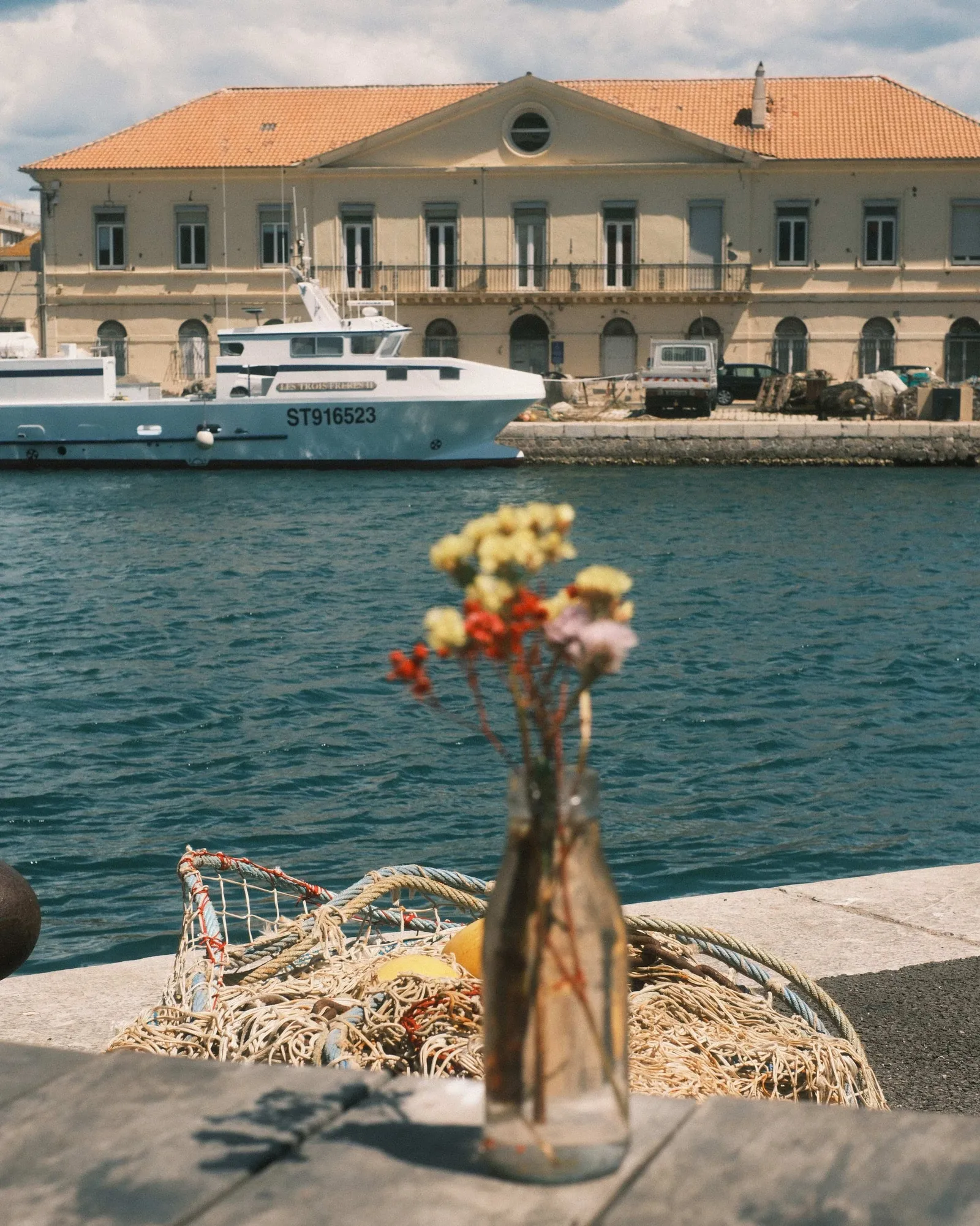
Last Summer Roll is a recipe I discovered through Emanuele De Luca, an Italian photographer whose Instagram feed feels like a continuous summer afternoon. I shot it for a few days in Sète and Avignon without touching a setting, and it's now permanent on one of my X-E5 custom slots.
Built on Classic Negative, this recipe uses a strong Color Chrome Effect and a weak Color Chrome FX Blue to push reds and blues into a denser, more film-like response. The white balance is set to Auto with +3 Red and -5 Blue, which gives a slightly warm cast without going as far as Italian Summer does. Smooth Skin Effect is set to Weak, which is a nice touch for portraits and casual people shots.
What makes this recipe special is how Classic Negative handles skin tones and greens. Foliage looks lush, skin looks natural, and the slight color shift gives everything a "shot on film, found in a drawer ten years later" quality. Dynamic Range DR400 provides plenty of latitude in high-contrast summer scenes.
Last Summer Roll settings
| Film Simulation | Classic Negative |
|---|---|
| Grain Effect | Weak / Small |
| Color Chrome Effect | Strong |
| Color Chrome FX Blue | Weak |
| Smooth Skin Effect | Weak |
| White Balance | Auto, +3 Red, -5 Blue |
| Dynamic Range | DR400 |
| Highlight | -2 |
| Shadow | +0.5 |
| Color | +4 |
| Sharpness | 0 |
| Noise Reduction | -4 |
| Clarity | 0 |
| Exp. Compensation | 0 to +1 |
| ISO | 640 to 1600 |
When to use it
Last Summer Roll is a versatile recipe for daylight summer photography. Street scenes, casual portraits, food, gatherings, late afternoon walks. It handles people particularly well thanks to the Smooth Skin Effect and the Classic Negative base.
It's less suited to harsh midday sun (the DR400 helps but contrast can still be tough) and to very low light, where Classic Negative's color response can shift in ways that are hard to predict.
Summer Chrome by Osan Bilgi
Created by Osan Bilgi.
Summer Chrome is the boldest recipe on this list. It's a Classic Chrome look with everything turned up: strong grain, strong Color Chrome Effect, strong Color Chrome FX Blue, and pushed shadows. The result is a punchy, contrasty, slightly retro image that works beautifully in the strong directional light of summer.
I've been following Osan's work for a while (the creator of the famous Classic Cuban Neg recipe), and his use of Classic Chrome is what convinced me to try this recipe. It has a 1970s travel-magazine quality. Reds are deep, blues are dense, and the heavy grain gives even quick smartphone-style snapshots a sense of weight.
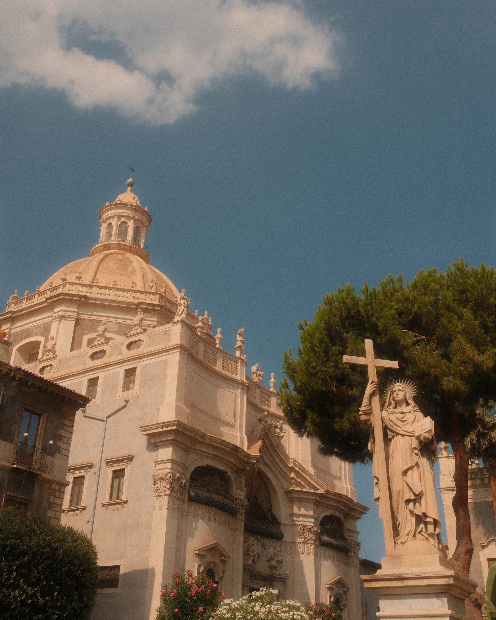
The white balance shift (+5 Red, -6 Blue) is more aggressive than Italian Summer, which makes the recipe lean further into warmth. Highlights and shadows are both pulled down to -2, which compresses the dynamic range and gives the image that printed-photo feel.
Summer Chrome settings
| Film Simulation | Classic Chrome |
|---|---|
| Grain Effect | Strong / Large |
| Color Chrome Effect | Strong |
| Color Chrome FX Blue | Strong |
| White Balance | Auto, +5 Red, -6 Blue |
| Dynamic Range | DR400 |
| Highlight | -2 |
| Shadow | -2 |
| Color | +4 |
| Sharpness | 0 |
| Noise Reduction | -4 |
| Clarity | -4 |
| Exp. Compensation | 0 to +1 |
| ISO | Auto, 500 to 6400 |
When to use it
Summer Chrome thrives in strong, direct light. Beach days, white walls, bright cars, neon signs in the early evening, pool parties, anywhere there's a bold color you want to make even bolder.
It's not the right recipe for soft, delicate scenes. If you're shooting muted color palettes, foggy mornings, or quiet portrait work, this recipe will steamroll the subtlety.
Bright Summer by Ritchie Roesch
Created by Ritchie Roesch on Fuji X Weekly
Bright Summer was created by Ritchie Roesch, modeled after the work of Dubai-based photographer Preet. It's a Classic Chrome recipe with a high white balance (7100K), pushed exposure compensation, and minus Clarity, which together create a bright, low-contrast, slightly hazy look that feels like a hot afternoon by the pool.
The unique thing about Bright Summer is the Clarity at -5. This setting softens the image globally and creates a subtle haze, almost like shooting through warm air. Combined with the +1 to +2 exposure compensation that Ritchie recommends typically using , the recipe produces images that feel sun-bleached without losing color information.
Grain is set to Off, which is unusual on this list, but it works because the soft Clarity setting already adds character. If you prefer a bit of texture, setting grain to Weak / Small is a fine modification.
Bright Summer settings
| Film Simulation | Classic Chrome |
|---|---|
| Grain Effect | Off |
| Color Chrome Effect | Strong |
| Color Chrome FX Blue | Off |
| White Balance | 7100K, -4 Red, -2 Blue |
| Dynamic Range | DR400 |
| Highlight | -2 |
| Shadow | -2 |
| Color | +4 |
| Sharpness | 0 |
| Noise Reduction | -4 |
| Clarity | -5 |
| Exp. Compensation | +1 to +2 (typical) |
| ISO | Auto, up to 6400 |
When to use it
Bright Summer is at its best in hot, hard light. Bright walls, parked cars, swimming pools, suburban streets at noon, signs and storefronts. It has a strong American summer feel, somewhere between a road trip photo and a postcard.
A note on compatibility: Clarity is only available on certain Fujifilm cameras. If yours doesn't have it, a 20% CineBloom or 1/2 Black Pro Mist filter is a good substitute, as Ritchie himself often points out in the comments of his blog.
Velvet Dreams: for twilight magic
Once the sun is down and the sky turns those shades of purple, pink, and deep blue, I switch to Velvet Dreams. It's my own recipe for that narrow window of about 15 to 40 minutes after sunset, when light fades but the sky comes alive.
Velvet Dreams is built on Velvia, a Fujifilm film simulation many photographers avoid because of its reputation for being oversaturated. During twilight, however, when ambient light is naturally soft, Velvia brings out tones that other simulations completely miss. The strong white balance shift (+8 Red, +7 Blue) pushes the sky into purple and warm violet territory, giving images that dreamy, almost painted quality.
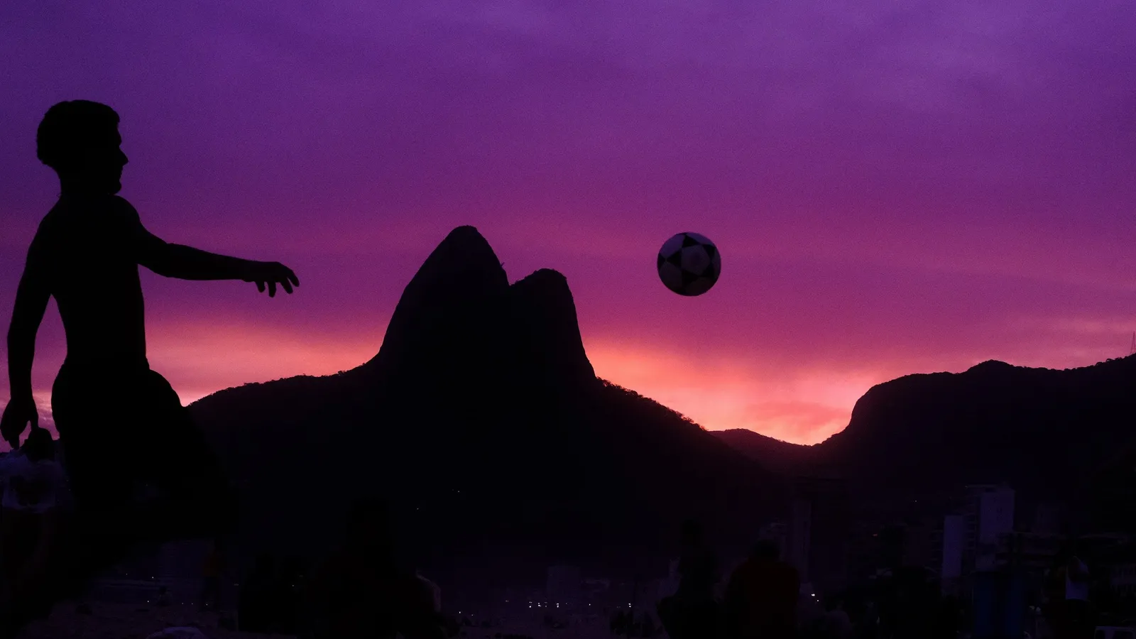
Color is set to +3 for richness, Noise Reduction at -2, and the rest is left neutral so the file has room to breathe. ISO needs to be adjusted manually because light changes quickly during twilight. I usually start at 400 and ramp up as the sky darkens.
Velvet Dreams settings
| Film Simulation | Velvia |
|---|---|
| Grain Effect | Weak / small |
| Color Chrome Effect | Off |
| White Balance | Auto R+8 B+7 |
| Dynamic Range | AUTO |
| Highlight | 0 |
| Shadow | 0 |
| Color | +3 |
| Sharpness | 0 |
| Noise Reduction | -2 |
| Clarity | 0 |
| Exp. Compensation | 0 |
| ISO | Adjust manually |
When to use it
Velvet Dreams is a specialty film recipe. It's not versatile, and that's intentional. It shines for twilight skies with purple and pink gradients, silhouettes against colorful evening light, coastal scenes with open horizons, city skylines at dusk, end-of-day street scenes when the sun has just disappeared.
It's not designed for daylight, indoor scenes, or skin tones. Use it for the sky, and use silhouettes to ground your composition.
A tip: look for water. Reflections on the sea, wet sand, or even puddles can double the impact of those purple and warm tones.
Bonus: Classic Cinema for Summer Video
Summer is a season I shoot a lot of video. Family dinners, road trips, beach mornings, kids running on the sand. For all of it, I use Classic Cinema, the only video recipe I've kept on my camera for the past two years.
Classic Cinema is built on Classic Negative with a flat tone curve and reduced detail (-2 Sharpness). The result is footage that feels like it was shot on film, without the harsh digital sharpness modern Fujifilm sensors produce by default. White balance is set to Auto with +3 Red and -6 Blue, which gives skin tones a natural warmth that holds up well through long summer days.
The ISO range is intentionally limited to 200 to 640. Classic Negative shifts color in unpredictable ways at higher ISOs, so keeping it tight ensures clean, consistent footage.
Classic Cinema settings
| Recording Mode | FHD 16:9 29.97P (enough if sharing on social media) |
|---|---|
| Alternative Mode | 4K 16:9 29.97P (higher quality, bigger file) |
| Stabilization | IBIS (if available) |
| Film Simulation | Classic Negative |
| White Balance | Auto R:+3 B:-6 |
| ISO | 200 - 640 |
| Dynamic Range | DR100 |
| Tone Curve (Highlights) | -1 |
| Tone Curve (Shadows) | -1 |
| Color | +3 |
| Sharpness / Details | -2 |
| High ISO NR | -2 |
| Interframe NR | AUTO |
| Chromatic Aberration Correction | Yes |
When to use it
Classic Cinema is perfect for travel vlogs, family videos, casual B-roll, street scenes, and any summer footage where you want a documentary feel without the headache of color grading. Pair it with a 1/4 Black Pro Mist filter for a softer, more cinematic image, especially in bright outdoor light.
Avoid it in very low light (beyond ISO 640), green screen work, or any project where you need maximum flexibility in post.
How to choose between them
| Recipe | Best for |
|---|---|
| Italian Summer | Daytime in warm climates, daily driver |
| Last Summer Roll | People, evening events |
| Summer Chrome | Bold, contrasty scenes wanting maximum punch |
| Bright Summer | Hot, hazy afternoons |
| Velvet Dreams | Twilight |
| Classic Cinema | Video |
Five Fujifilm film recipes is a lot, so here's how I think about it in practice. Italian Summer is my daytime daily driver in warm climates. Last Summer Roll is what I switch to when I'm shooting people, or during evening events. Summer Chrome is for bold, contrasty scenes where I want maximum punch. Bright Summer is for those hot, hazy afternoons. Velvet Dreams is for twilight, and Classic Cinema is for video.
Every recipe on this list is a colour recipe. When I want the colour gone entirely, I switch to one of my black and white Fujifilm recipes, which are built on ACROS and Monochrome rather than Classic Chrome and behave very differently in the same harsh summer light. And if six looks feels like too many to carry, the three that stay loaded on my camera all year round are in my favourite recipes for 2026.
I keep all of them programmed into my X-E5 custom slots, accessible from the Q-menu in two button presses. Before I post any of these, I'll usually run the JPEG through my own film border generator. Small thing, but it finishes the frame. The frames I like most end up on paper rather than on a feed, printed at home on a Canon Selphy CP1500.
Tested on Fujifilm X-Trans IV (X-T30ii, X-T4, X-E4, X100v, …) and V bodies (X100vi, X-T5, …). Some settings may not be available on older models. If you are not sure which generation your body belongs to, or you are still choosing one, I keep a full breakdown of the Fujifilm lineup with a sensor and IBIS table. Adjust freely. A recipe is a starting point, not a rulebook.
You can find more Fujifilm recipes here.
Help me keep writing
If these articles are useful to you, have a look at what I make.
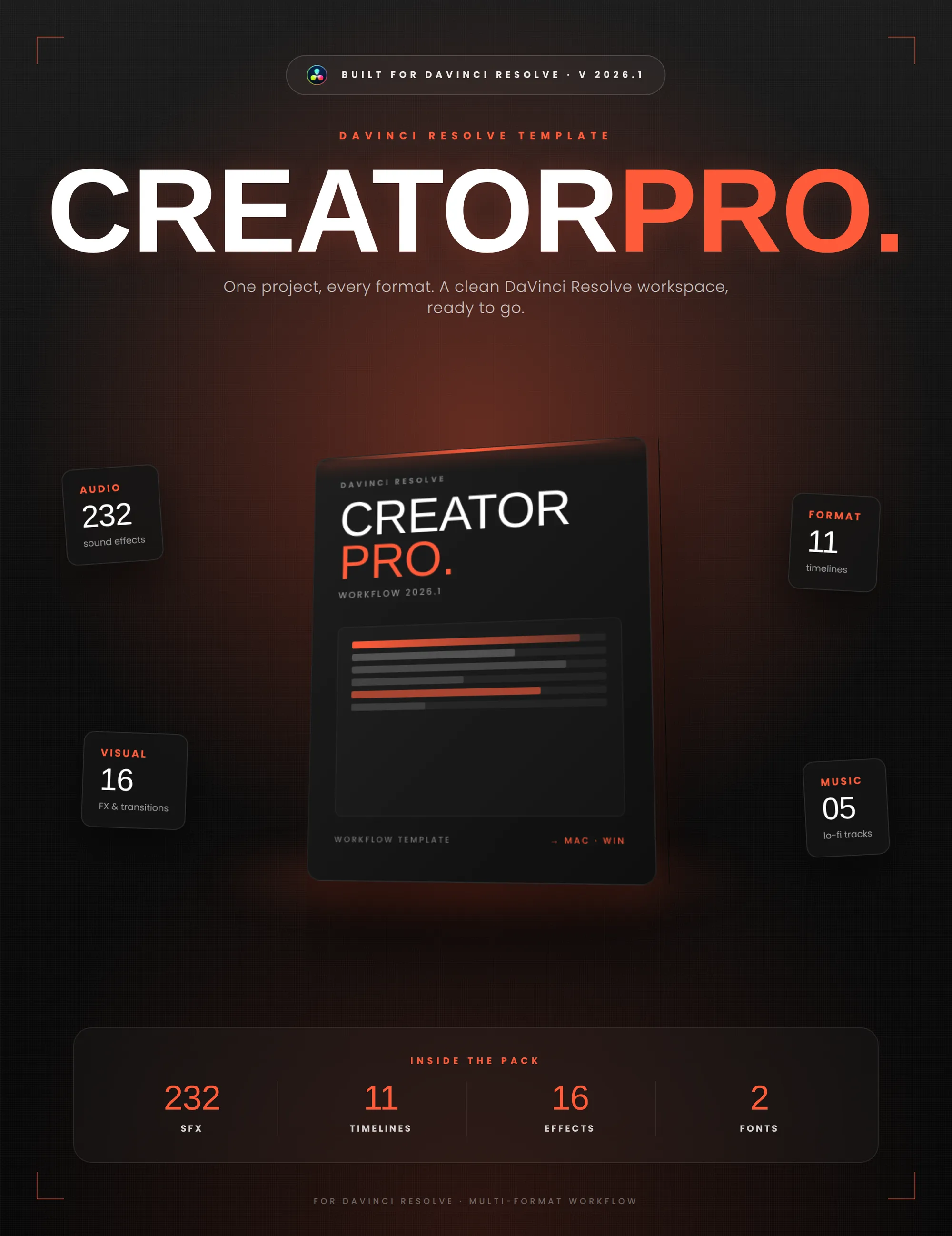
Creator Pro
The ultimate DaVinci Resolve workspace for creators
View plugin — €29.00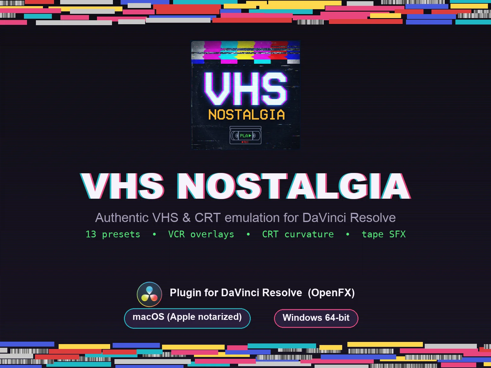
VHS Nostalgia
Real VHS & CRT emulation for DaVinci Resolve
View plugin — €49.00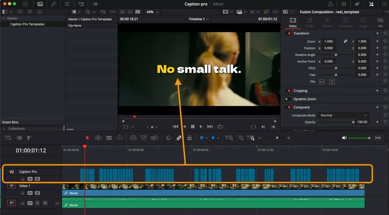
Caption Pro
Automatic word-by-word captions and translation for DaVinci Resolve
View plugin — €49.00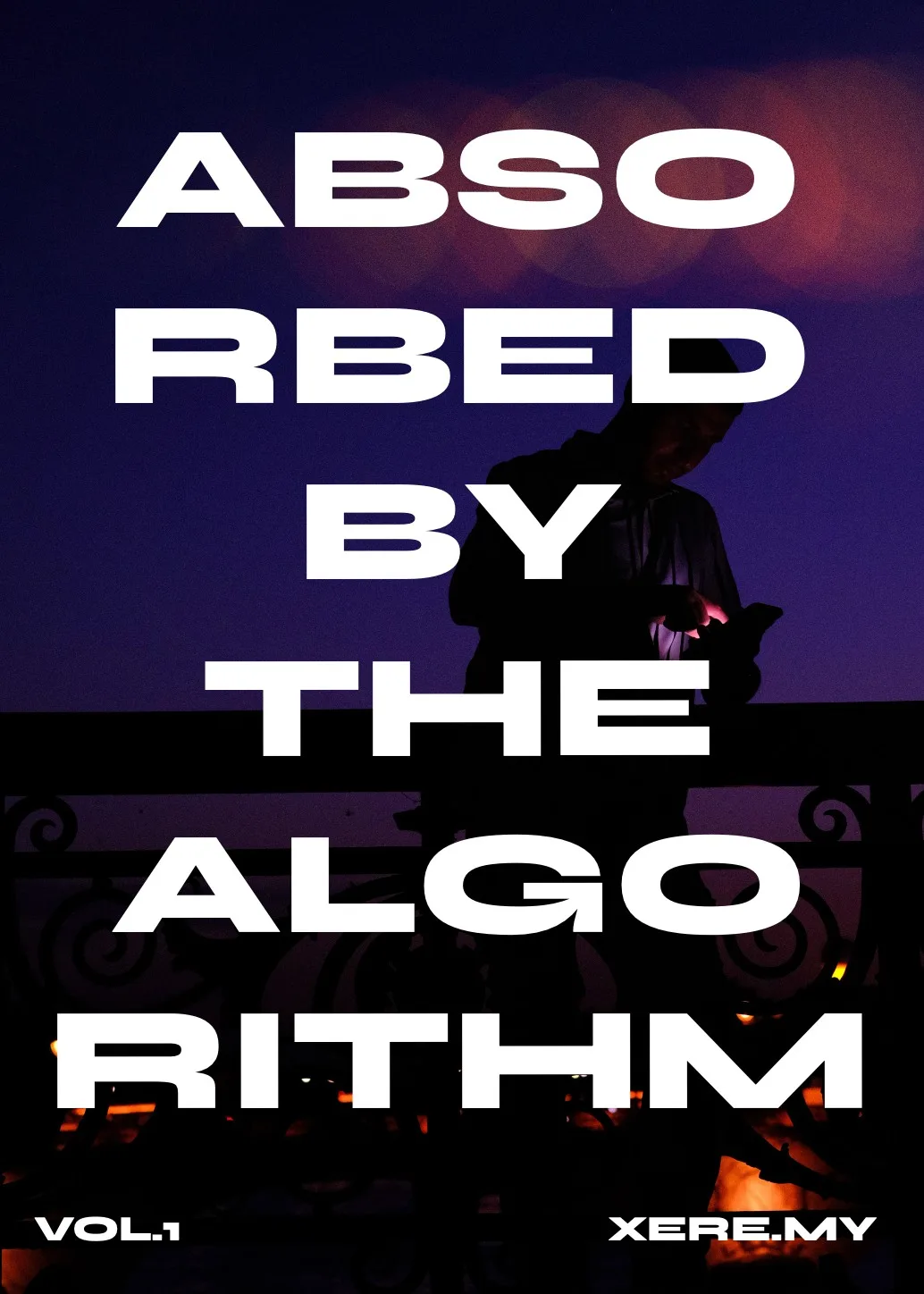
Get the zine
"Absorbed by the algorithm Vol. 1": 33 images shot in Paris, 28 pages, shipped worldwide.